If you've been around MattMakes3D for a while, you might notice it looks a little different today — because it is. I've been steadily improving the site as the print log has grown, and the latest pass is the biggest one yet.
I've been using Claude alongside this project for a while now. What's new this time is that I split the work between two different Claude tools, and it made the whole redesign surprisingly smooth.
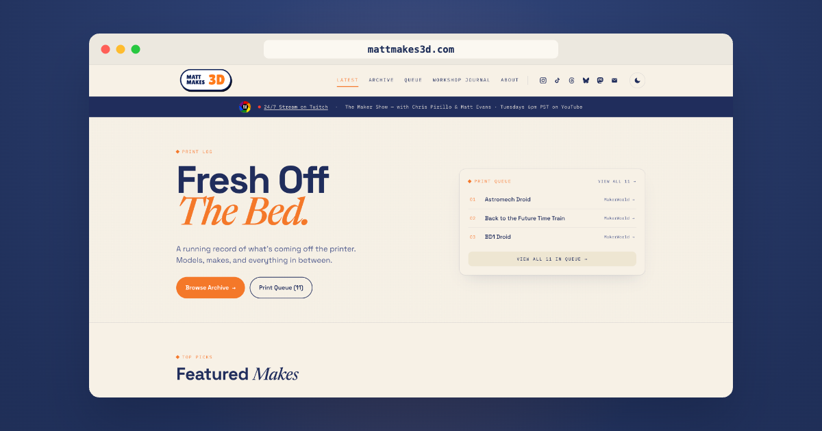
Claude Design did the visuals
I started with a fresh brand pass. A new logo lockup. A new color palette — warm cream paper, deep navy ink, and a bright orange accent that finally feels like me. Three typefaces I genuinely like: Space Grotesk for headlines, IBM Plex Mono for the small caps and meta text, and Newsreader italics for the moments that needed a softer voice.
Claude Design produced a complete handoff: prototype pages, asset files, and a written spec for the new design system. It was less like asking for one mockup and more like getting a small design studio's worth of decisions made in one sitting.
Then Claude Co-Work built it
I dropped the handoff zip into Co-Work, told it about the existing Astro site, and we worked through the implementation page by page. The homepage, the print archive with its new grid/timeline toggle, the print queue, the about page, the individual print pages, and a brand-new /links page for link-in-bio purposes.
It was less "ask AI to write code for me" and more like pair programming. I'd answer questions, make the calls, push back when something didn't feel right, and Co-Work would do the heavy lifting. The whole thing got built, tested, and shipped in a fraction of the time it would have taken me to do it solo.
What's actually different
A few things I'm especially happy about:
The site is more user-friendly. Print cards have real hover states now. The archive has a search bar that actually works. The print queue reads cleanly. Mobile got proper attention this time instead of being an afterthought.
There's a real dark mode. The little sun/moon button in the header flips between a warm cream daytime palette and a deep navy nighttime one. Your preference saves and comes back the next time you visit. The whole site transitions smoothly between the two — no flashes, no broken contrast.
The About page actually reads like me. New photo, new layout, a Facts sidebar with the quick details (where I'm based, what I print on, when I started), and a callout for MakerDeck.
This is version 2.0 of MattMakes3D.com — yes, there's a tiny "v2.0" in the footer. I'm a sucker for build numbers.
Take a look around
Toggle the dark mode. Click into a print. Scan the queue to see what's coming off the bed next. If you have feedback on what's working or what's confusing, I'd love to hear it — that's how the next pass gets even better.
More to come.
— Matt